Project Manna
RESPONSIVE WEBSITE
Client: Project Manna
Role: UX/UI Designer, Researcher, Photographer
Time Frame: 80 Hrs
Tools: Adobe XD, Photoshop, Miro, Zoom
The Problem.
Building something new
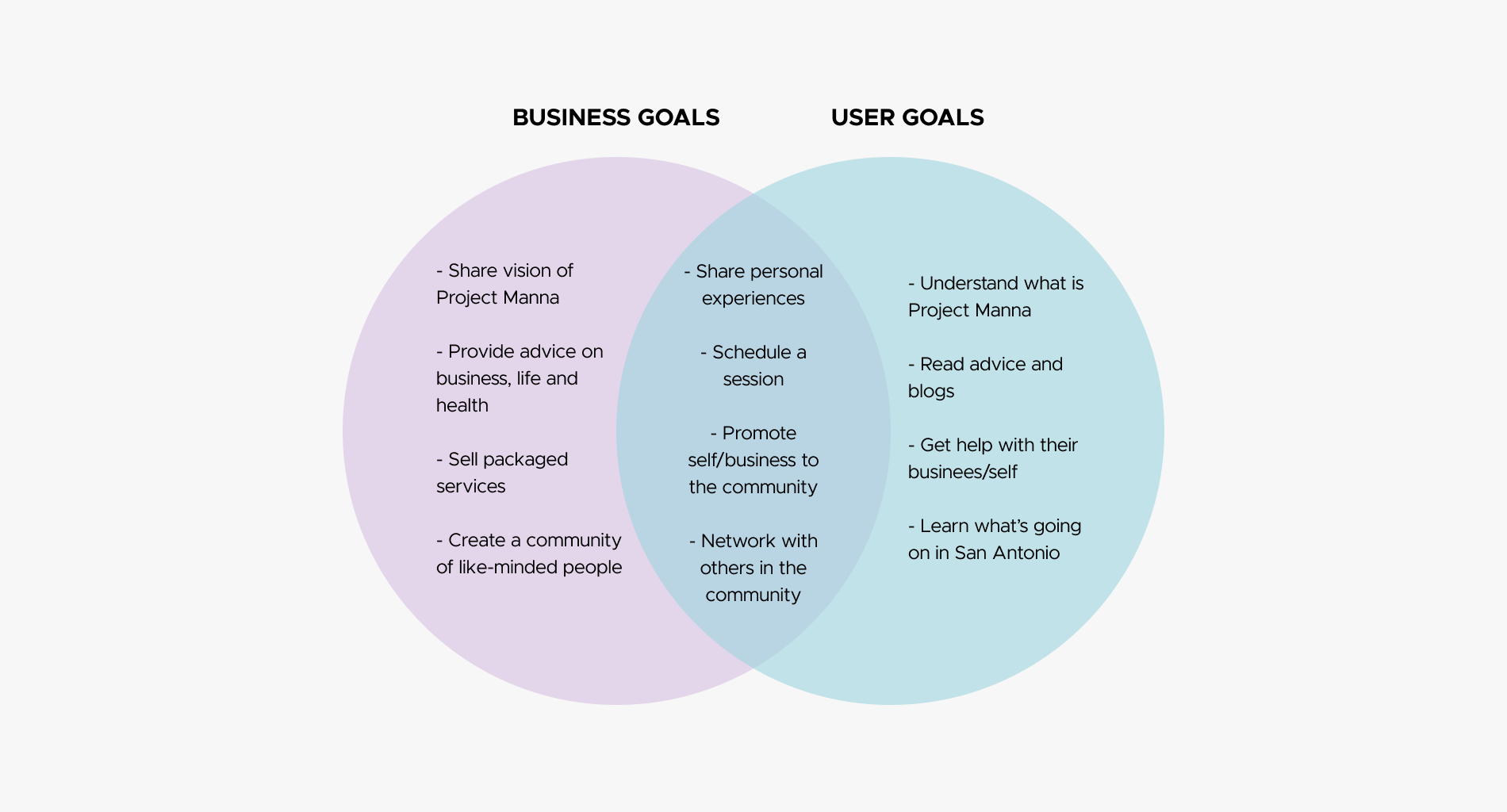
When contacted by Kristine, founder of Project Manna, she did not have a clear plan for her new consulting business. She had a vision for helping the community (such as creatives, churches, and business owners) but not how she could market herself to these groups. She knew that she needed a website to communicate her services and wants to create a community of support.
Kristine quit her job to start this business after gaining life coaching certification. She hopes by building a website that new clients can understand her more as a person, learn about her services, and hire her for consulting. Creating this site is one of the first steps to her starting her business, so I wanted to make sure I represented her well and effectively.
How might we introduce
Project Manna to potential clients?
The Solution.
This is Manna
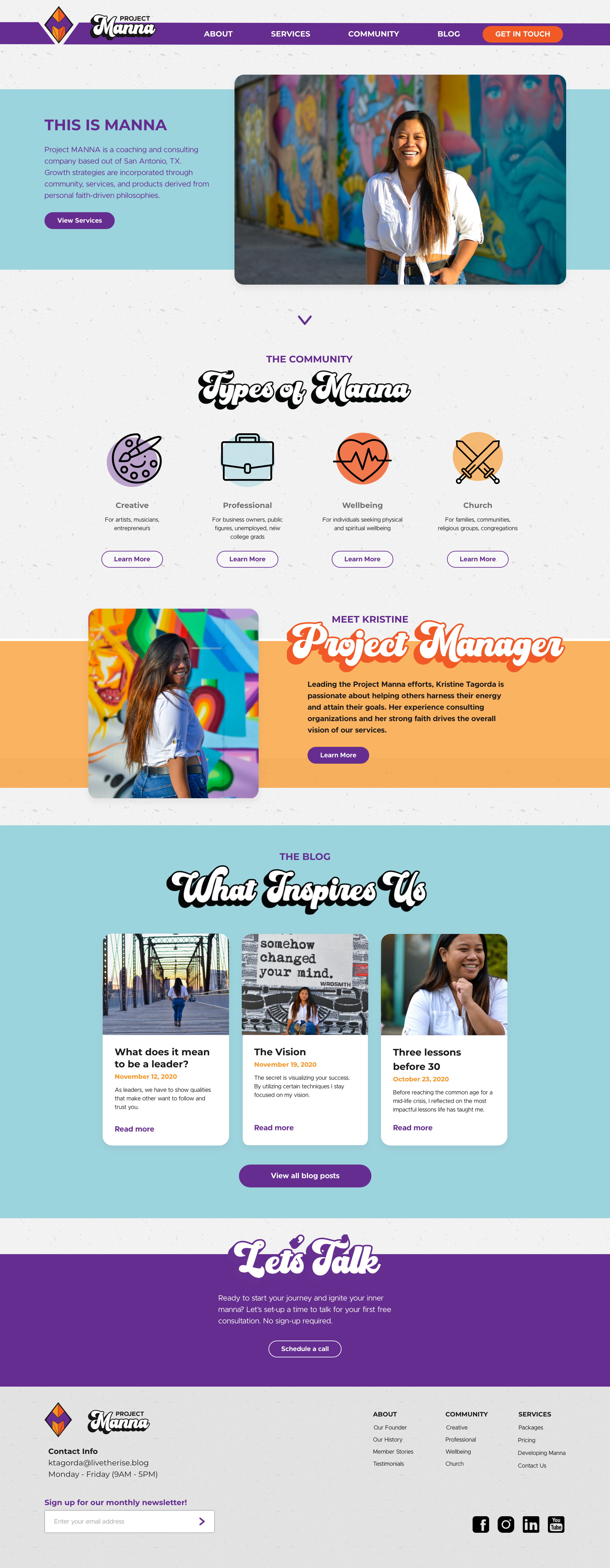
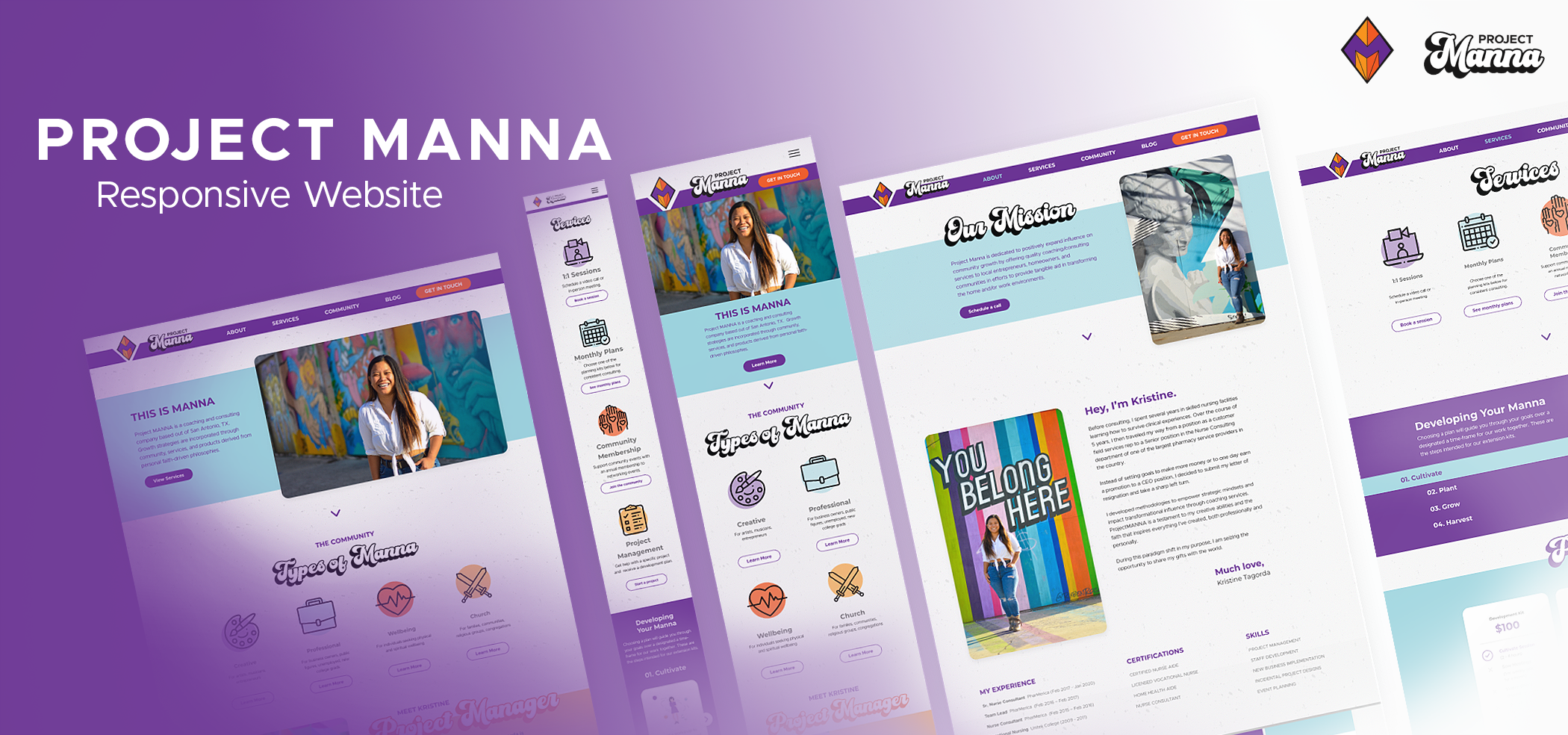
Project Manna's website characterizes Kristine's vibrant energy and excitement to help others. Together we created a branded website that will position her differently from other life coaches and consultants in the area.
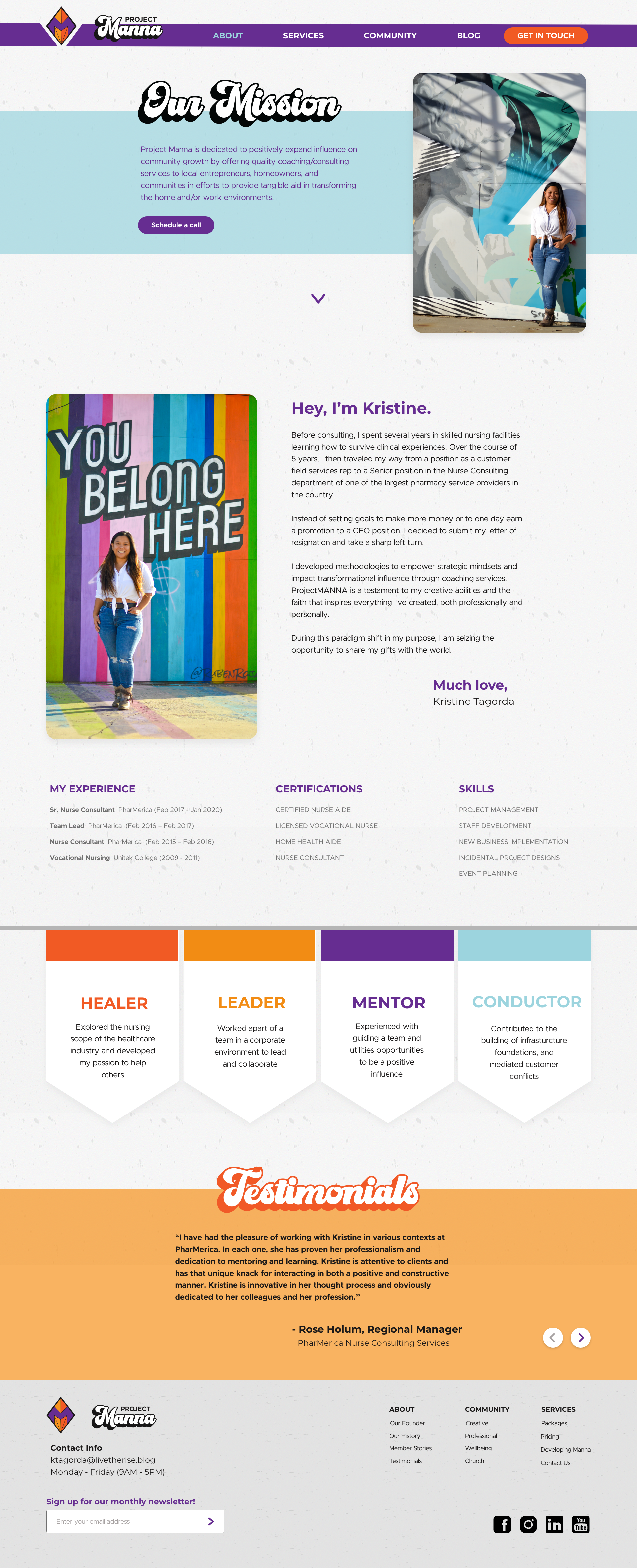
Through user interviews, we realized that it's important that she builds trust, credibility, and a network to become a valued resource. We aim to do this with an in-depth about me page, blog posts, and a community network.
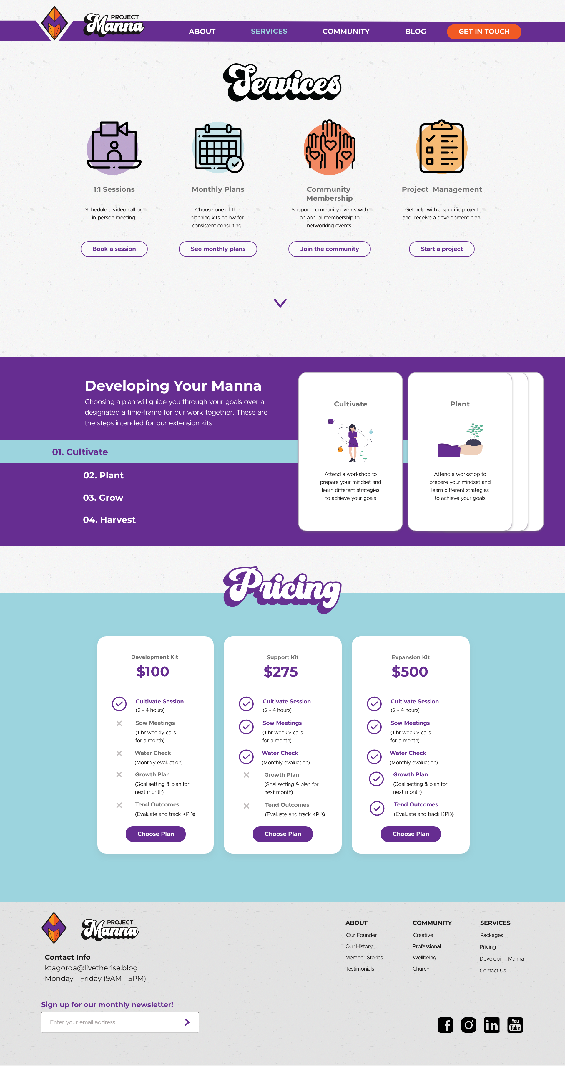
I wanted to develop the site to help her envision how she can market her business. Even though she didn't have the content finalized yet, I prepared a pricing page, an interactive journey process, and community pages. She approved of the current design and we are working with a developer to see if everything is buildable or if it needs more revisions.
Design Process
We started off by going over her business plan and goals. We discussed what content she already had prepared and what content she would want on the site in the future. She had blog entries ready to be featured and wanted to allow members of her community to be able to comment and share experiences as well.
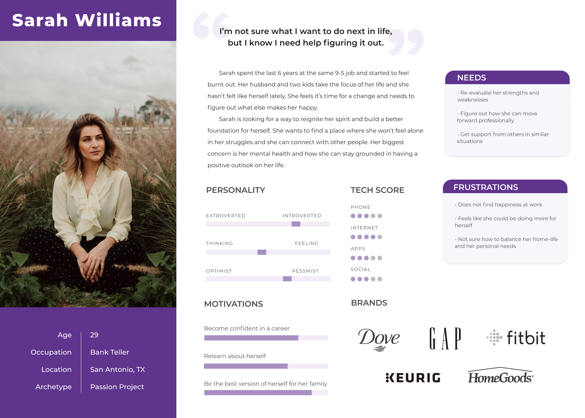
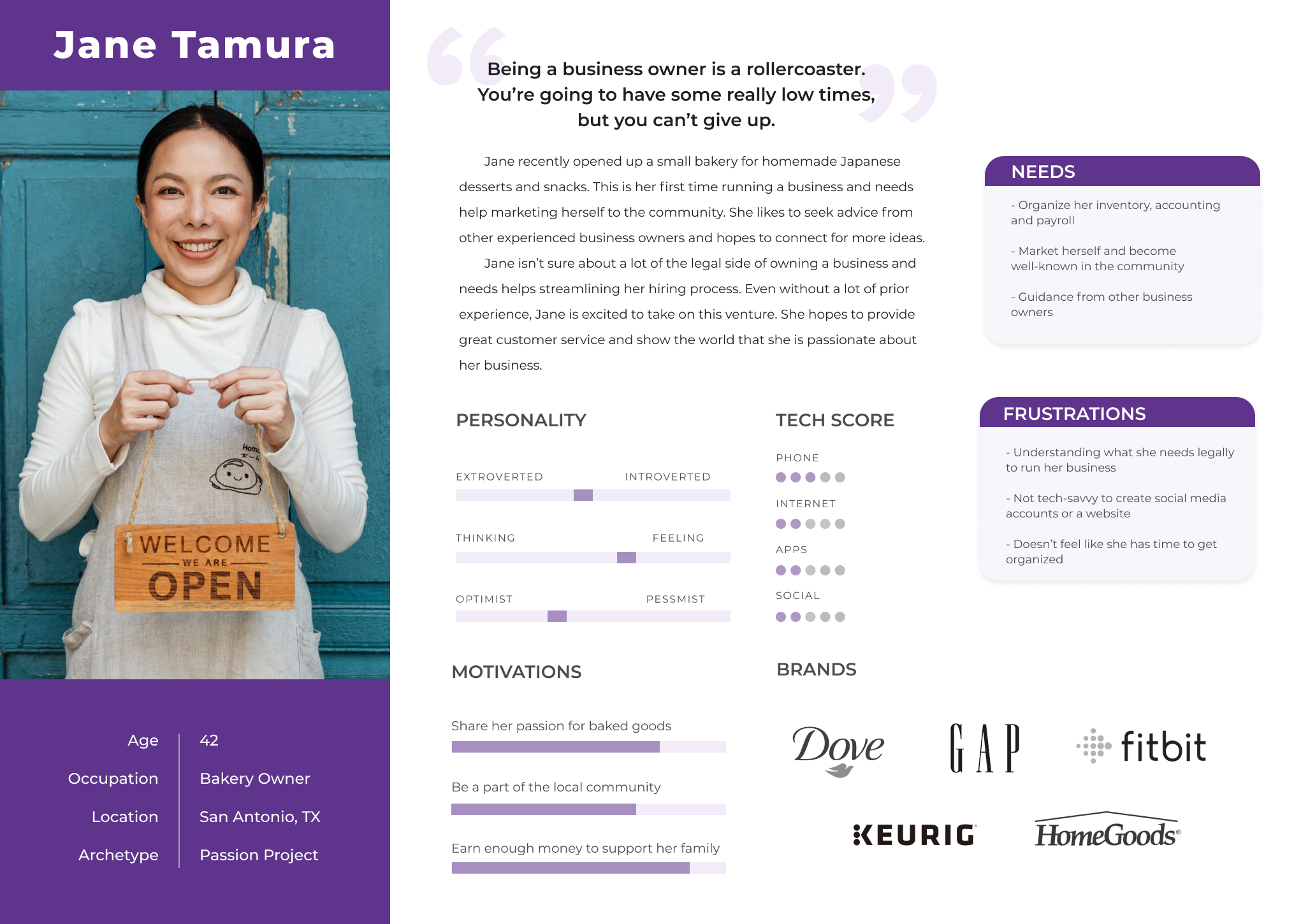
When we first started scoping who her target audience is, it seemed like she wanted to focus on her life coaching and creating a community. After conducting user interviews with four participants about how they seek advice and help, we found that experience is a big factor in who they trust. Since Kristine has limited experience as a life coach, we decided to leverage her past experience helping business organizations instead. I conducted another set of user interviews with four business owners to learn what consulting services would interest them.
Link to original research plan for life coaching.
Link to research plan for business owners.
Link to empathy map for interview synthesis.
INFORMATION ARCHITECTURE
Organizing the Site's Content
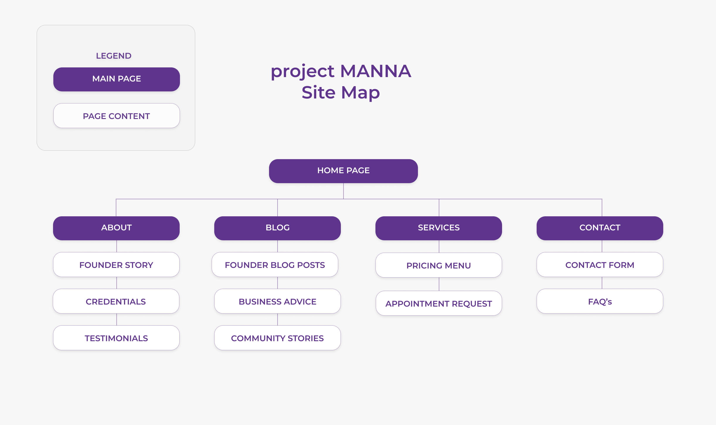
Before designing the site, I laid out how the pages would be organized. I looked at other consulting sites to see the standard page options. This map would later expand to include another main page link to "community."
BRAND IDENTITY
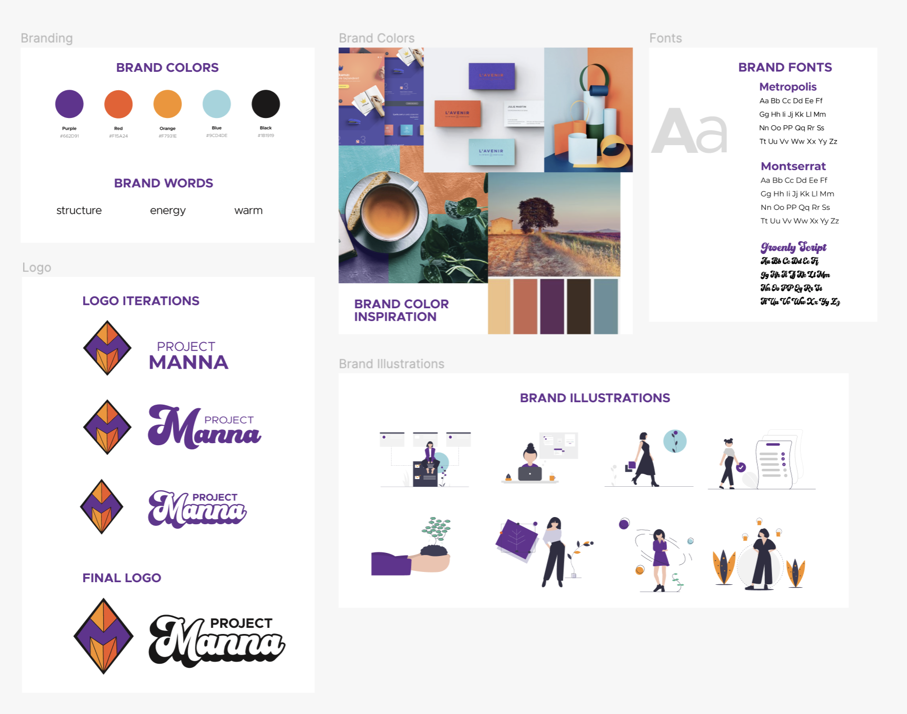
Creating a Warm, Energetic Brand
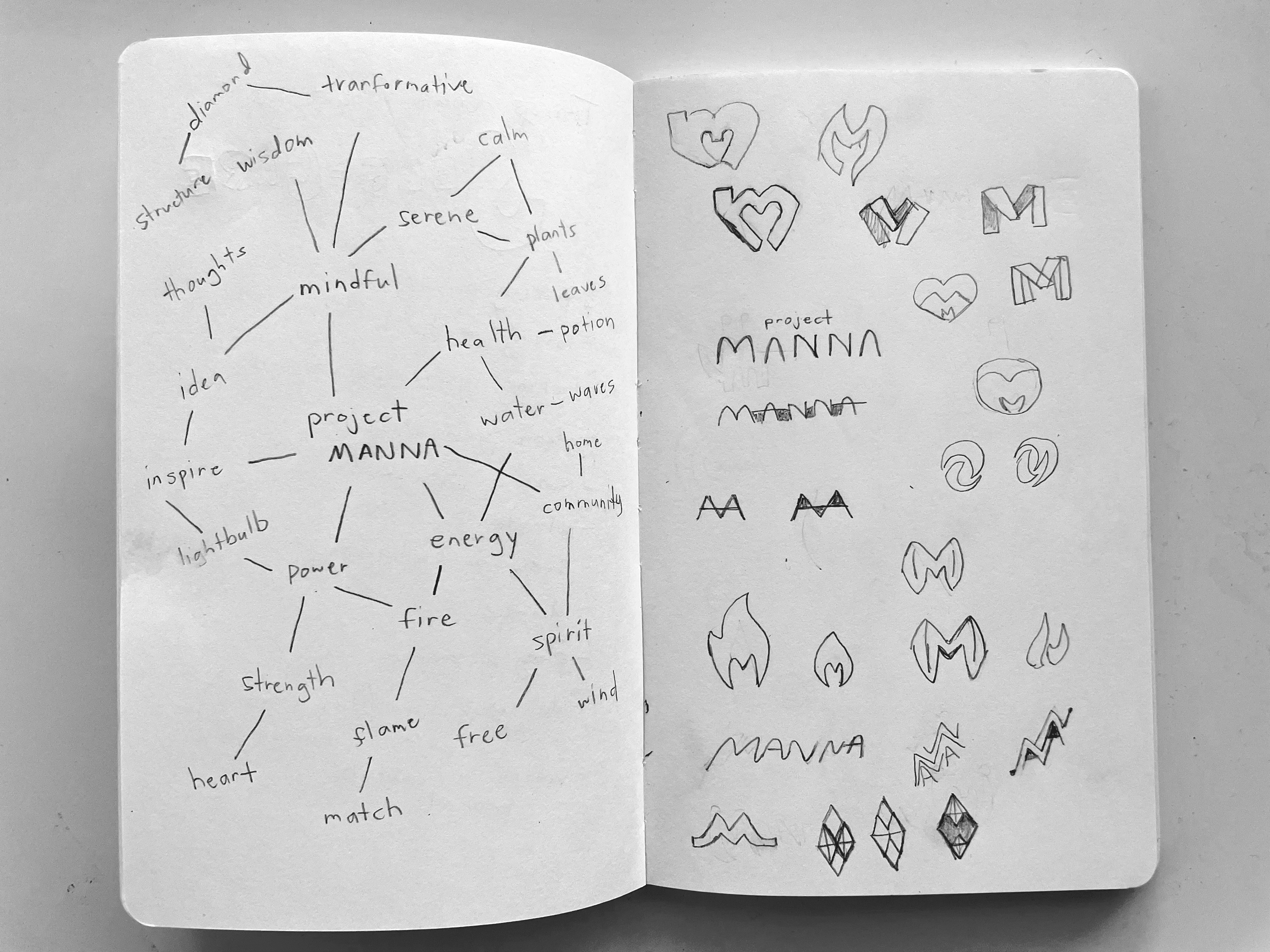
Together, we looked at competitor websites to get a feel of what she liked and didn’t like. I designed mood boards and showed her color schemes to see what resonated with her. After coming up with brand words that would describe her, I sketched and digitized logos in Adobe Illustator. Lastly, I provided her with different font combinations to choose from to pair with the logo. We finalized a logo that showed structure, a warm color theme, and chose a font that felt energetic and lively.
FINAL PROTOTYPE
Creating Content for the Pages
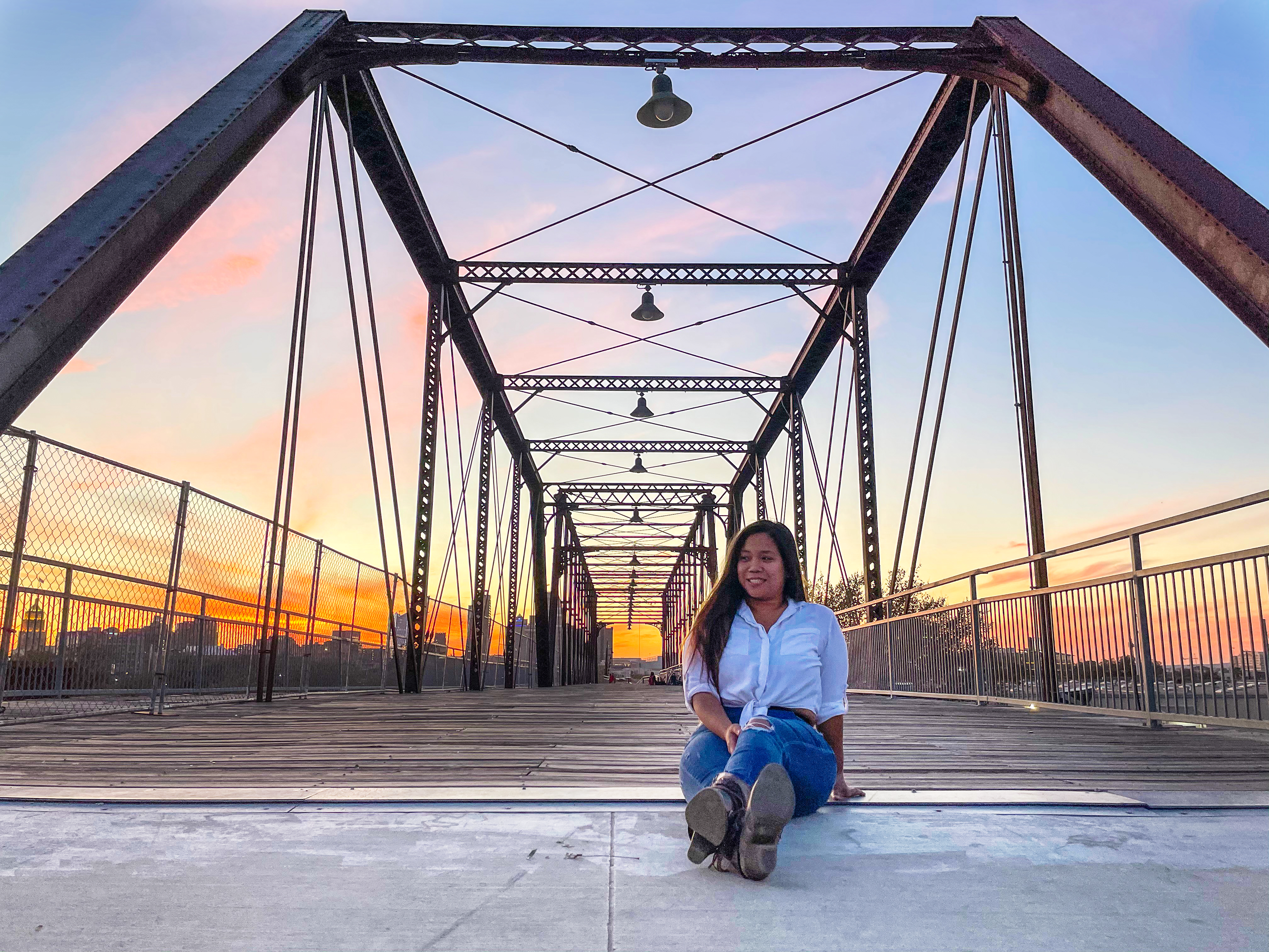
The difficulty in making the final prototype wasn't in the design decisions, but it was in creating content for the pages. Though Kristine has a vision for her business, she hadn't finalized pricing or written her messaging. I waited for her "About Me" information and came up with a lot of filler content so that she could fully-picture her website format. I also provided a photoshoot so that we had great imagery throughout the site.
RESPONSIVE DESIGN
Making a Mobile Version
To make a responsive website, I designed the web pages on a mobile-sized artboard. I utilized a hamburger menu for navigation. Most of the items were stacked and formated for scrolling. For some of the interactions, I switched for the objects to be viewed in a slider.
RETROSPECT
Learning and Challenges
The tough part was creating a solution without enough content provided by the client. I wanted to give her a website format and provide inspiration for her site. Also, this was my first time designing on Adobe XD. Compared to Figma, the hover components require more detailed settings. I had to learn how to control the hover properties and keep them consistent throughout the prototype.
THE HANDOFF
Sharing my Adobe XD files with a Developer
"Your files and layers were very organized. I was really impressed and it made it easy to build."
- Christina, developer
I reached out to one of my friends that was looking to improve her developer portfolio and asked if she'd like to help with this client's website. Luckily, she is also familiar with Adobe XD and I just had to share my file with her. We held a Zoom meeting to go over expectations and a timeline for the build. She agreed to work on the build, even though we have not finalized all content yet.
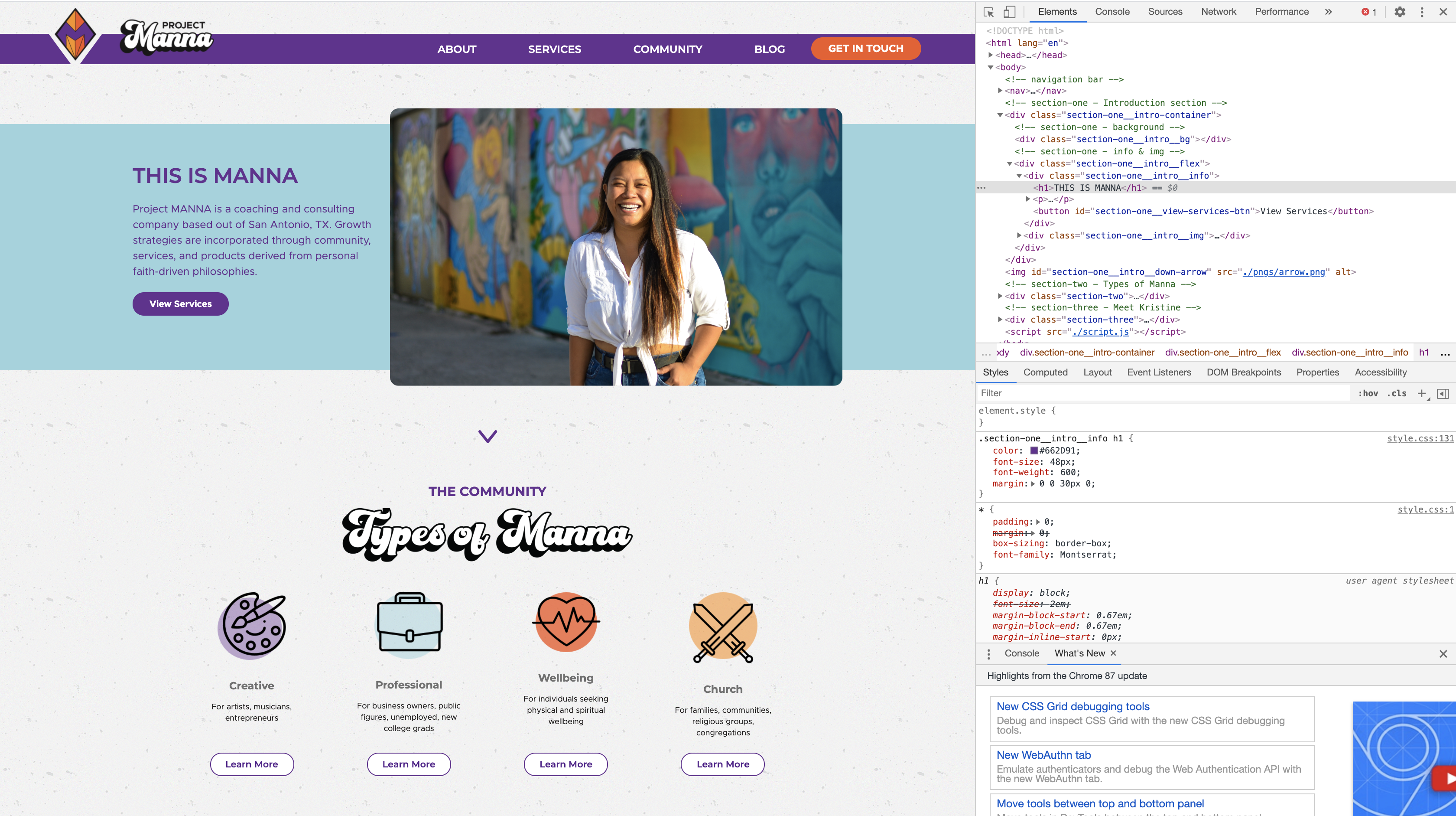
Screenshot of the page preview and HTML file for the home page design
NEXT STEPS
Test Real Content
Though we already have a developer working on the build, I plan to test the current prototype with more accurate business information. Pricing and service descriptions need to be updated and I'm waiting for my client to make these decisions. If we can test it with the real information, we will be able to gather opinions on the content as well as test the usability of the site.
View More Projects

WayfinderProject type
Convenient CheckoutUX Design
GaydarDATING - Mobile App
Stream RaidersGAMING - Responsive UX/UI Design
